Vruti Chokshi
Reimagining the
Travel Booking Experience
project example
from visa 2024
OBJECTIVE:
A national bank wanted to develop its own travel portal but needed insights into industry best practices, customer needs, and potential value propositions to create a competitive offering.
Our objective was to research the travel landscape, identifying key features, user expectations, and opportunities for differentiation. We aimed to provide a clear narrative that would guide product development and demonstrate the value of pursuing this initiative.
TEAM:
Product Lead (me), Product Director (oversight), Design Director, Staff Designer
MY ROLE:
-
Project Planning & Cross-Functional Coordination
-
Client Communication & Relationship Management
-
Competitive & Market Analysis
-
Narrative Development & Presentation Structuring
-
User Research & Insight Synthesis
-
Workshop Design, Facilitation & Outcomes Mapping
-
Design Feedback & Iteration Guidance
DELIVERABLES:
-
Competitive Analysis Report covering 8 peer and industry-leading brands, highlighting table stakes and best-in-class experiences
-
User Research with 25 travelers, resulting in key mindsets and persona development
-
Virtual Ideation Workshop with client stakeholders, facilitated via Figma
-
Prioritized Concepts Translated into High-Fidelity Screen Designs
-
Usability Testing with Target Users, followed by Iterative Design Refinement
-
Final Recommendations Deck including Validated High-Fidelity Screens
APPROACH:
o1 Competitive Analysis
Evaluated and documented key features across eight peer and industry-leading travel portals, analyzing functionality, usability, and overall user experience. Assessed booking flows, personalization, rewards integration, and customer support to identify strengths, gaps, and opportunities for differentiation.

Based on insights from peer experiences and experience hypotheses, mapped key travel stages, illustrating how each stage contributes to the overall journey.


Synthesizing insights from the peer assessment, I identified table stakes necessary for competitiveness, key differentiators that could set the bank’s travel portal apart, and gaps in existing offerings to highlight strategic opportunities.
Presented a clear strategic direction, outlining must-have features and areas for innovation to guide the portal’s development and positioning.
o2 User research & mindsets
Conducted user research with 25 travelers to gain insights into their habits, needs, and pain points, with the synthesis revealing four distinct themes that span all aspects of the customer experience.


After conducting the interviews, we synthesized our findings into a comprehensive report. Each one-pager highlighted specific customer needs and the corresponding design implications. Through this process, we identified four distinct themes that emerged across all aspects of the customer experience


Leveraging insights from user interviews and competitive analysis, we created customer mindsets that captured key behaviors, motivations, and pain points, providing a strategic framework to guide design decisions and ensure alignment with user needs throughout the travel portal development.


Two mindsets were prioritized—each reflecting distinct user groups with unique needs and preferences—and would serve as the foundation for our design decisions.
These mindsets not only helped us tailor features and functionality to user expectations but also ensured a more personalized, seamless experience by focusing on their specific pain points, motivations, and desired outcomes throughout the travel journey.


03 Workshop & JourneyMap
Building on our research insights, we hosted a collaborative workshop to translate our findings into action. During the session, we generated over 90 ideas, exploring various opportunities to enhance the customer experience. Our team then prioritized these ideas, ultimately crafting an ideal state journey map supported by low-fidelity screens


To ensure alignment and focus, we developed Guiding Principles—key criteria that helped us prioritize ideas based on their impact, feasibility, and strategic fit. These principles provided a clear framework for decision-making, leading us to craft an ideal state journey map supported by lo-fidelity screens


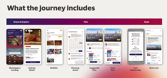
An ideal user journey map was developed to map out the key steps and features, outlining all relevant pages and touchpoints in the interaction.
Collaborated closely with the design team to create lo-fidelity screens that visually conveyed the user journey and experience.

04 iterative prototyping & usability testing
The design team created hi-fidelity screens to visually represent the concepts, bringing the user flow to life. I worked closely with the design team, building strong relationships and collaborating to create assets that truly resonated with customers.
Beyond contributing to the creative process, my role was to lead the team—ensuring alignment, maintaining focus, and keeping the project on track.
I also developed the discussion guide for usability testing, led the testing sessions, and synthesized the insights. These findings not only refined our designs but also helped shape a more compelling narrative for the travel portal.


Conducted usability testing to validate design concepts, identify potential usability issues, and ensure the user experience met the needs and expectations of our target audience


In our final recommendations report to the client, we included all the hi-fidelity screens along with iterations informed by user research, direct feedback from usability testing, and key design callouts.

Tying it all together, we revisited our Guiding Principles to ensure our recommendations aligned with our strategic vision. Using insights from usability testing, we refined our ideas and proposed a future-state experience that addressed key customer needs.


Our recommendations were brought to life through hi-fidelity screens, providing a clear and actionable vision for the next steps. To support implementation, we created one-pagers for each screen, highlighting key lessons from user testing and design callouts on how to take the experience to the next level.
This left our client with tangible assets to confidently move forward.